Everyone has a cell phone with a great camera in their pocket and landscapes are a very popular thing to photograph. How do you stand out from the crowd? Learning landscape specific compositional rules will get your photos a cut above the others fast.

Eyes vs. Camera
You’ve been hiking for 3 hours. The sun is just starting to set. The view is breathtaking. You take out your camera and snap a picture. Meh. It doesn’t look at all like it does in real life. There’s none of the majesty, the colors aren’t as vibrant, and the scene doesn’t look right.
Something like this has likely happened to you. Our eyes and our camera see the world differently. You cannot just point your camera at whatever looks beautiful to your eyes and get an exact replica of what you see. It requires more thought. You need to consider how your camera sees color, exposing the scene correctly, and lens focal length. Maybe you have those technical elements down. What’s left? Composition. Your eye may not need you to compose what you look at to see the beauty, but your camera does. Here’s how.
Horizon Placement
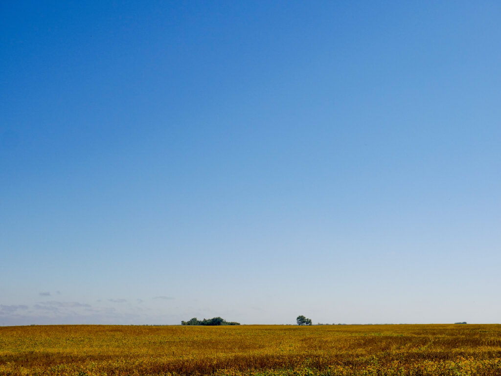
If the “land” in the landscape is interesting, it should take up more of the image (higher horizon placement). If the land is less interesting or the sky is more interesting, more of the photo should be sky (lower horizon placement). This aspect of landscapes is also connected to other compositional elements. The rule of thirds and balance must also be considered when choosing a horizon placement. Whether there is at all, or how much foreground interest exists also can affect horizon placement.
Foreground Interest
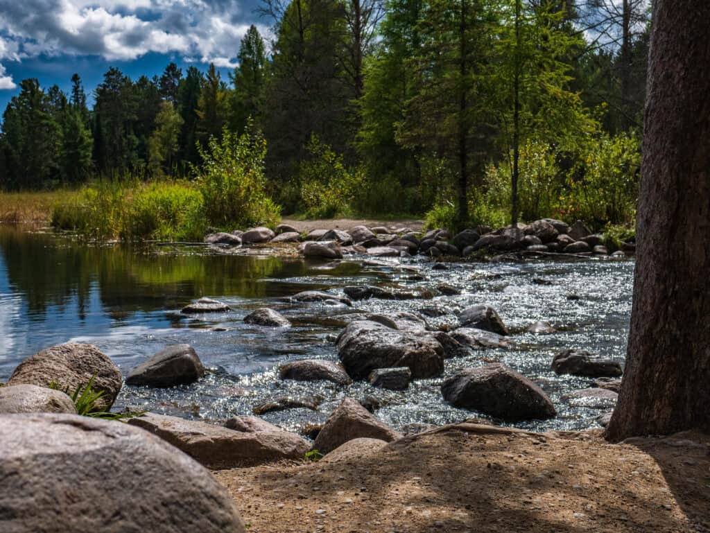
Break up a landscape with interesting elements in the bottom third of the image. These elements should be much closer to you than whatever is behind them to create depth and draw the eye into the image. Leading lines can be used effectively with foreground interest to accentuate depth.
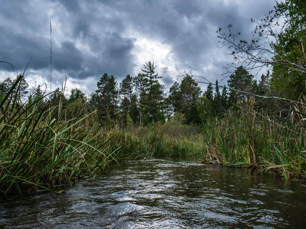
When the focus of the landscape is something in the foreground, more of the image can be dedicated to it. Make sure to leave enough depth in the image when including more foreground.
Symmetry
This can make for incredibly well-balanced photos but is difficult to find in nature. To be clear, you can have a balanced landscape photo without symmetry. A great way to create symmetry in your landscape photos is to look for reflections in still water. Another way to get symmetry in landscape photography is to zoom in. Symmetry is easier to find on a small scale.

Planes
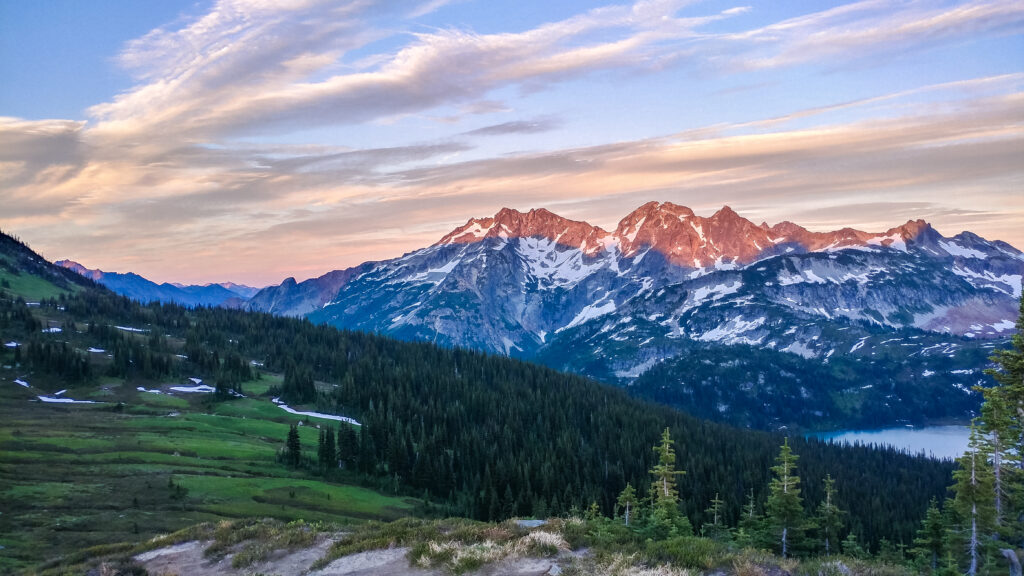
This is not always true, but a landscape image with 5 or more planes is usually very compositionally interesting. A plane is an area of the image that appears to be closer or farther away than another part of the image. For example, the image below has 7 planes.
- The sky
- The mountains in the distance in the left third of the frame
- The larger mountain that occupies the center of the frame
- The Lake on the right edge of the image
- The trees that go across the entire image
- The grassy area in front of the trees
- The ridge with the gravel, grass and tree in the foreground
Try to find the point of view with the most planes that also follows other compositional rules.
Simplicity
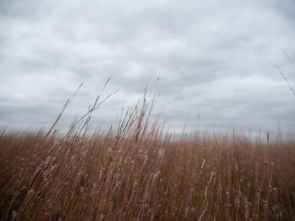
Sometimes it’s better to get in close and keep your landscape images simple. Go the opposite direction of the rule of planes. Keep only part of the image in focus. Shoot the landscape like it wasn’t a landscape. Every shot of a landscape doesn’t need to be immense and grandiose. Try keeping it simple.
Framing with Nature
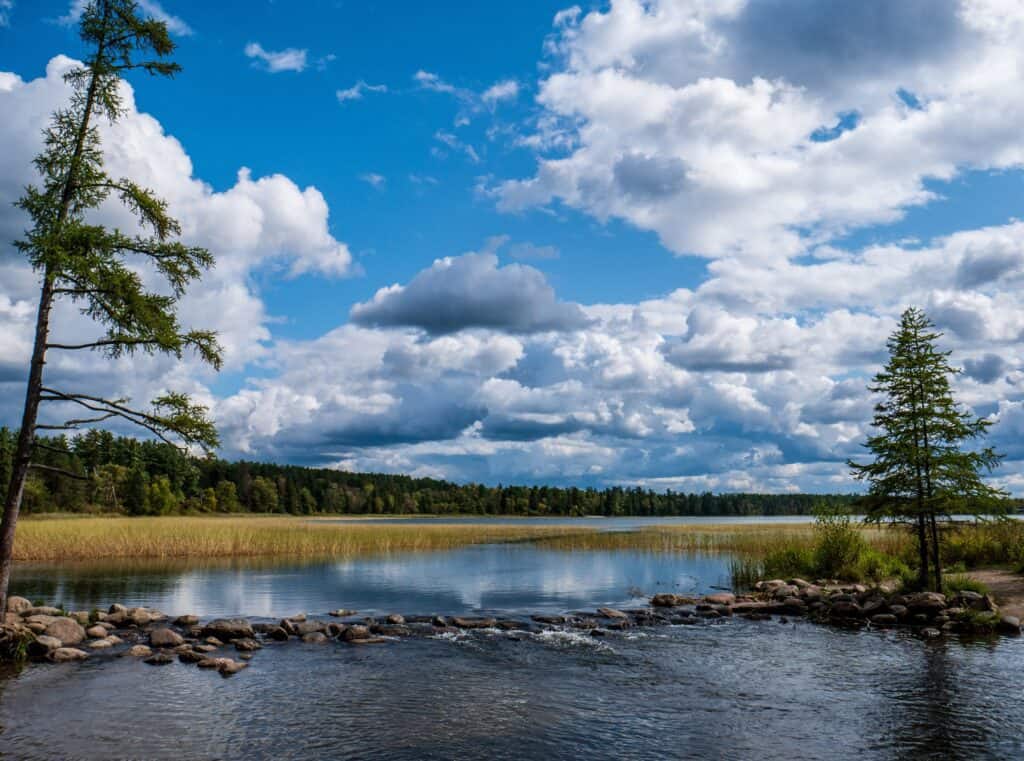
Framing is one of the general rules of composition and is important to keep in mind when thinking about photographing a landscape. Trees are often the best way to frame a landscape, but large rocks, mountains, and waterfalls are some other great landscape elements that can be effectively used.
Keep a Level Horizon
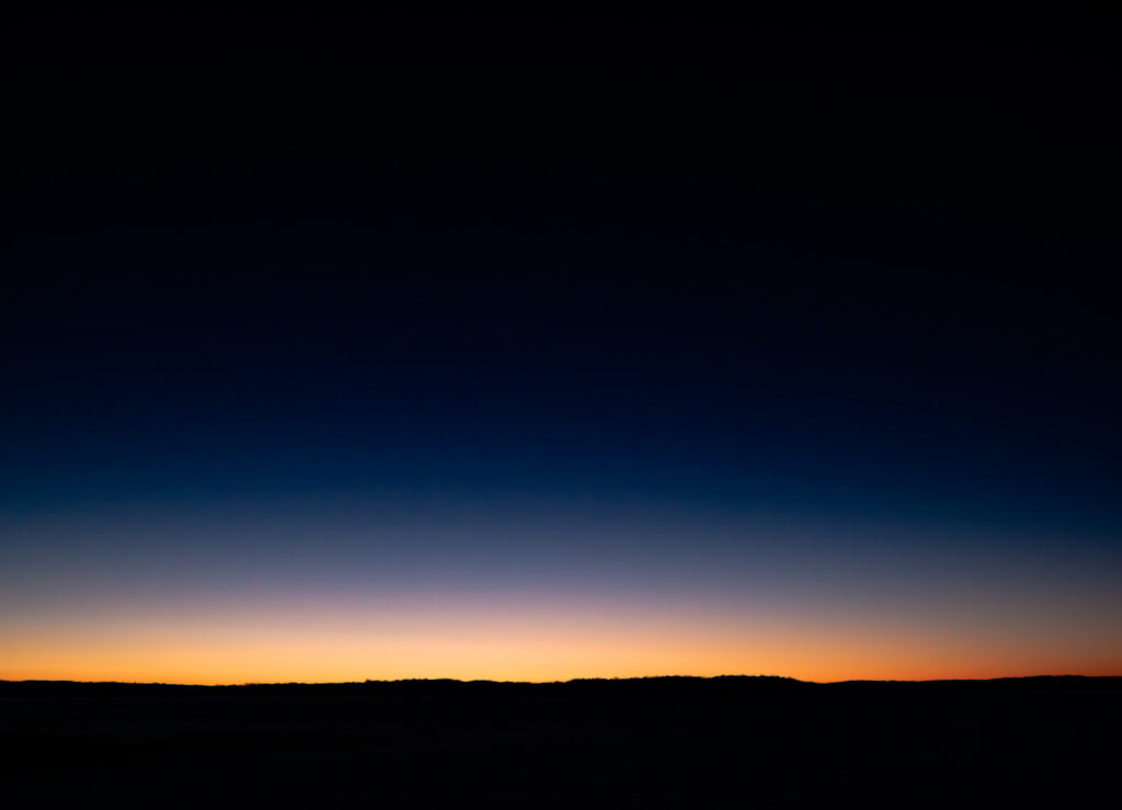
Make sure that your image has a level horizon. It doesn’t matter how well composed the rest of the image is, because if it doesn’t have a level horizon, it will look wrong.
Taking Great Landscape Photos
The rules of composition are tools in a toolbox. A screwdriver should not be used to hammer a nail, and likewise, you should apply the rules of composition where they make sense. Only practice will lead to knowing which tool to use and why you should use it, so get out there and take some pictures!
