These composition rules are at the heart of great photography. Understanding how they can be effectively followed (and broken) will make you a better photographer. Learning composition is an ongoing and ever-evolving process, but you can always come back to these basic rules.
Rule of Thirds
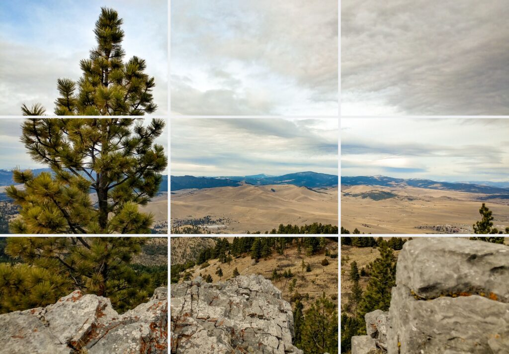
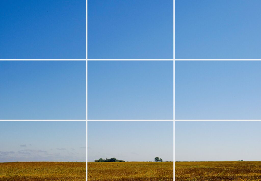
You may have heard of this one before. Divide your frame into thirds horizontally and vertically. The subject of your photo should go on one of the 4 places where these lines intersect. By putting the subject on the intersection of these lines, it invites the eye to explore the rest of the image and makes the photo feel more open. Modern digital cameras have a setting to show these lines on your camera’s back screen.

Subject is on an intersection point in the lower righthand corner. The horizon is confined to the lower third of the image.
The rule of thirds can also be useful for dividing the image into visually pleasing sections. The horizon of an image can be set along one of the two horizontal lines. Elements of the photograph that are not the subject can be placed next to the vertical lines instead of directly on top of them.
When working with multiple points of interest, it is important to put the most prominent and interesting one on an intersection point.

Tree is not on, but along the left vertical line. The foreground is confined to the lower third of the image. This better separates it from the background. The brightest point of the image, the sun, is on an intersection point.
Framing and Leading Lines
Both framing and leading lines are used to draw attention to the subject of the photograph. Roads, tree lines, windows, street lamps, and shorelines can all be used to frame and lead the eye. Using these compositional elements adds depth and interest to photos. Like the rule of thirds, these elements invite the eye to explore more of the image. To keep the eye interested longer, use multiple leading lines that go in changing directions and all lead to points of interest.

The shoreline leads the eye to the trees on the right third of the frame. The trees lead the eye to the sky and frame the areas of interest in the left two thirds of the image. The top of the tree-covered hill and snowy lines in the mountain lead the eye back and forth, inviting you to explore the image further.
As you can see below, framing doesn’t need to be from the foreground. Elements from any plane in the image can be used to frame the subject.

The trees in the background of the image frame the subject of the photo (the dead tree).
Framing also doesn’t need to be done by actual elements of the photograph. You can frame a photograph with out of focus areas. This can be done by opening your aperture to decrease depth of field. To learn more about depth of field, see here. The out of focus areas can effectively frame the image if a sharp enough distinction between the in and out-of-focus areas exist.

Example of framing with focus. The eye is pulled to the center of the image. The lines indicate where the sharp change in focus occurs. The focus frames the image according to the rule of thirds. Image also uses leading lines in the boards to pull the eye through the image, giving it depth.
Balance
There is no rule to balance, but that doesn’t mean it doesn’t matter. Balance must be understood to make creative choices. Different elements have different visual weight. Elements such as writing, strong color, bright light, eyes, large objects, and striking shapes have more visual weight and draw more attention. Having elements like these on only one area of a photo will make it unbalanced. To reiterate, it is OK to have an unbalanced image, but this should be a conscious choice. Unbalanced photos can be striking and thought provoking and balanced photos can be beautiful and serene. Play around with this concept to find what you enjoy.

Image has balance through symmetry and in its use of color and texture.
Negative Space
This is less of a rule and more of a tool. Negative space is an area of a photograph that is free from distraction, pleasing to the eye, and leaves room for the photograph to breathe. Positive space is the subject of the photograph and any areas of interest. Positive and negative space are related to balance. The relationship between them must be consciously chosen to have the desired effect on balance.

Photograph using mostly negative space to balance the bright, strong colors near the bottom of the frame.
Point of View
Changing your point of view is not a compositional rule, but a way to find interesting compositions. See what perspective incorporates the most compositional rules and find ones that break them too. Try taking pictures from different and strange places. If you take a picture like everybody else, it will look like everybody else’s. Get creative and stay moving.
Breaking the Rule of Thirds
So how do you break the rule of thirds and still have beautiful images? Have a different compositional element that overpowers the need for it. This is the answer for breaking any compositional rule. Let’s look at some examples.

Example of breaking the rule of thirds. The image uses powerful balance to break the rule of thirds and still be pleasing. The balance in the image is achieved by using complimentary and equally vibrant colors, as well as a strong use of negative space.

Example of breaking the rule of thirds. The main point of interest (the words in the top right) is not on a point of intersection and the image is not separated into thirds in any meaningful way. Having a very interesting subject and powerful colors overpowers the need for other compositional elements.

Example of breaking the rule of thirds. The horizon is at the bottom of the frame, the main point of interest is in the center of the frame, and the sun (another point of interest) is not on any intersection. This image can break the rule by having lots of depth. It accomplishes this in two ways. 1. There is an invisible leading line going from the plant in the lower left corner to the plant in the center to the sun. This line does not just draw the eye up and across the image, but through it. Each element in the line is on a different plane of the image, bringing the eye into the image, giving it depth. 2. The second way is through depth of field. There are 4 or 5 separate levels of focus in the lower part of the image. The plants up front are sharply in focus. The plant to the right of center is slightly out of focus. The plants to the right of that are very out of focus. And finally, the plants on the horizon line are completely out of focus. These 4-5 planes of focus add significant depth to the photo.
There are always exceptions to the rule, and now you know how to make them.
Breaking Leading Lines and Framing
This rule is easy to break, as leading lines and framing are less integral to the essential makeup of the image, and more so something that is added to an image for extra compositional value. The first image used as an example of breaking the rule of thirds also works for breaking leading lines and framing.

Example of no leading lines or use of framing.
Breaking the rule of Balance
This is not a rule that can be broken. There is no perfect level of balance that every photo should try to achieve. What people mean when they ask how to break the rule of balance is, “How do I take an unbalanced photo that still works?”. The answer to that is the same as before. Have another compositional element that is strongly present in the image. Balance is a little different though. The mood of the photograph, the colors it has, and the textures present determine whether or not an unbalanced photo will work.

Example of unbalanced photo that works. There are more trees and colors on the right side of the image and the trees from the left and right don’t meet in the middle. The photo still works because of the mood of the photo, the interesting textures in the trees and clouds, and the leading lines present along the top of the trees. The juxtaposition of the taller green tree next to the similarly sized reddish trees also adds interest to the photo.
Conclusion
You will automatically like certain pictures you take. Analyze them. Try to figure out why, so you can make it happen again.
