Editing your photos is a crucial step in the photography process. In this guide, I’ll teach you how and when to use the 13 basic Lightroom sliders (with before/after photos) in a real photo editing process.
RAW vs. JPEG
RAW is a non-destructive, lossless editing format; JPEG is not. This means you can edit RAW files without changing the original RAW image, and there is no compression causing lower image quality. RAW files also have more colors (68.7 billion or more vs. 16.8 million), greater dynamic range, and the ability to change white balance and color space without losing image quality.
The greater dynamic range makes retrieving highlights and shadows much easier. Editing in RAW is kind of like playing with Legos. You can make whatever you want, take it all apart, change individual pieces, and lose nothing. Editing in JPEG is like having most of the Legos already glued together.
The RAW file format is so much more powerful than JPEG for photo editing. If you intend to edit your photos (you should!), set your camera to shoot in RAW. If you want, you can set your camera to capture RAW and JPEG. I do this for easy photo identification because RAW files don’t show a preview for the image.
Getting Started
Start by importing your files into Lightroom or Lightroom Classic. I prefer Lr Classic because of the more data rich user interface and more powerful features including automatic lens profile corrections, more granular adjustments, and the transform tab.
Then move to the Develop tab in Lightroom Classic. If you’re in Lightroom, you don’t need to do this step.

Now that we’re on the develop tab, we can get started.
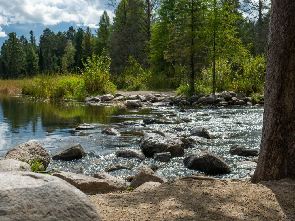
Look at the toolbar on the righthand side. This is where you make changes to your photo. We’ll go through each slider step by step. As for right now, everything except the “Temp” slider should be at zero.
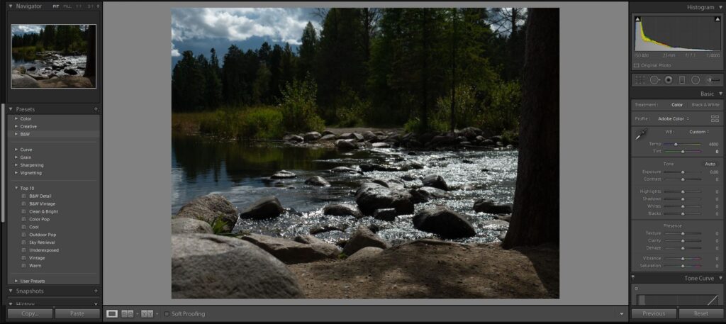
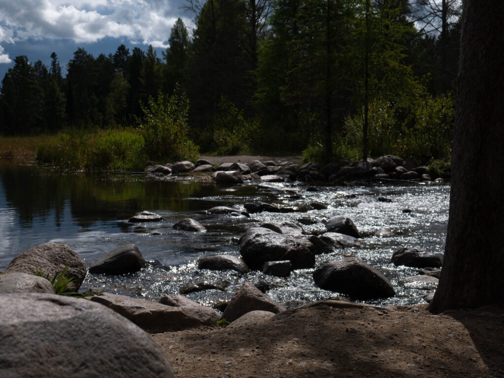
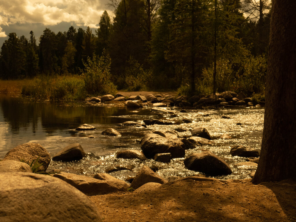
This is what your screen should look like. All sliders except the “Temp” slider is at zero. If you’re using a RAW image, the settings the photo was taken at can be seen in the upper righthand corner under the histogram. The image I’m using wasn’t taken at the proper settings. The photo is underexposed, and the ISO is too high for a daytime shot. I chose this less than ideal image because it shows the power of editing in RAW.
Temp and Tint Sliders
These sliders change the overall color of your photo. In most circumstances you won’t need to change these because modern camera’s auto white balance is usually very good. If you do need to change these, you should know what they do.
Temp changes the overall color of the photo to either be bluer or yellower (cooler or warmer). If you’re shooting outside during the day, it should show a number somewhere around 4500 Kelvin. If you want to learn more about color temperature, see my article on White Balance.
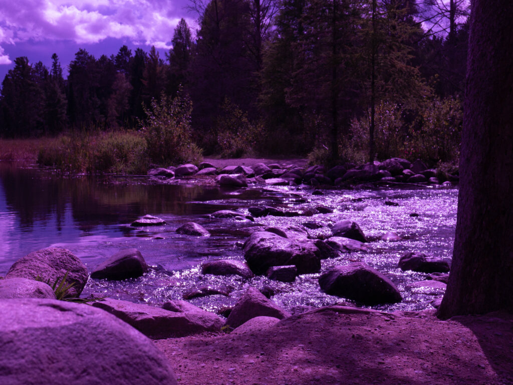
Tint changes the color of the entire image to be either greener or more purple. Both the temp and tint sliders can be used for artistic effect to create unnatural colors.
Exposure Slider
Now we can get to the editing. This one is simple. The exposure slider changes the brightness of the image. Be careful not to blow out your highlights or make parts of the image too dark when using this slider.
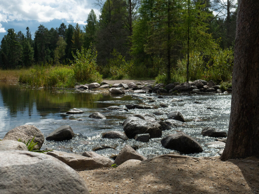
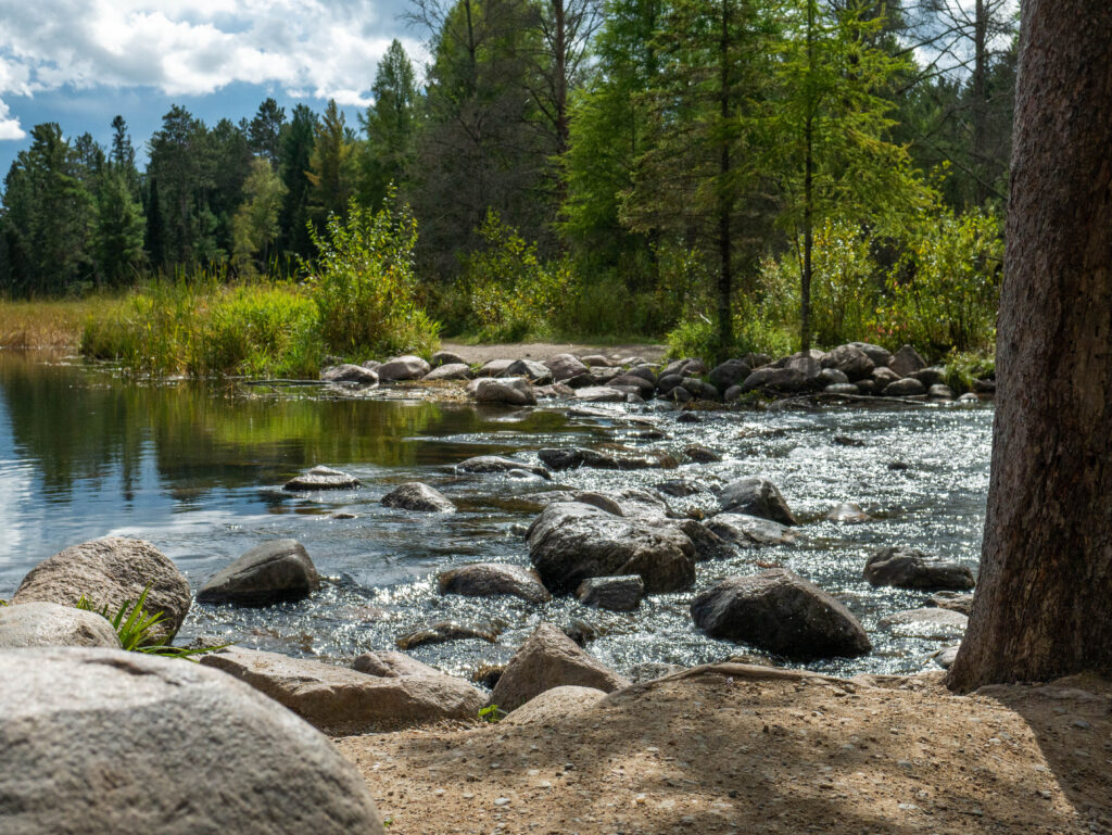
For this image, I chose to increase exposure by 1.40.
Note: a simple way to use the sliders is to click on the slider, then use your scroll wheel to change the value in increments of five. If you wish to reset a slider, simply double click on it.

Contrast Slider
The contrast slider changes the difference between light and dark areas of your image. Lowering contrast keeps image detail but flattens and softens your image. Raising contrast adds depth by creating separation and makes your image appear crisper but can remove detail and make your image look cartoony if pushed too far.
I increased contrast in my image to +25.

Highlights Slider
The highlights slider changes the brightness of pixels in your image within a certain tonal range. In other words, it either makes the brightest parts of your image brighter or darker. This is a great slider for retrieving detail in clouds, water, reflections, or other bright areas.
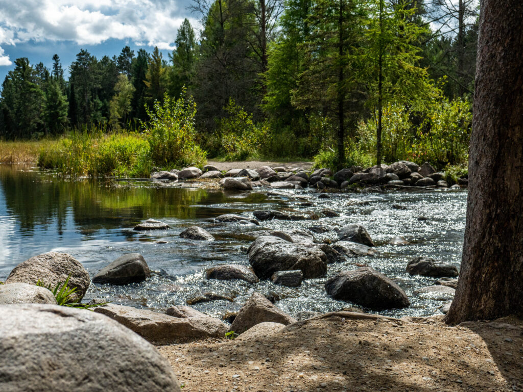
There are quite a few bright areas in this image, so I decreased highlights to -50.

Shadows Slider
The shadows slider changes the brightness of the darkest pixels in your image. It only affects a certain range of dark pixels and does not change the darkest point in the image. That is done using the “Blacks” slider. This slider is great for bringing back detail from underexposed areas of your image but can hurt image quality if pushed too far.
The trees in the background of my image are quite dark, so I increased the shadows in my image to +70.

Whites Slider
The whites slider changes the brightest point in the image and the amount of brightness in white tones throughout the image. This slider is more powerful than the highlights slider. Changing this slider is great for adding pop to an image but moving it too much can lead to a dull image, unnatural color, and/or a washed-out look.
I wanted to add a little pop into the image, so I increased the whites to +20.

Blacks Slider
The blacks slider changes the darkest point in the image and the amount of brightness in dark tones throughout the image. This slider is more powerful than the shadows slider. This slider is great for adding detail, contrast, and depth into your image, but pushing it too far can lead to a washed out or crushed image.
To add some detail into the trees, I decreased blacks to -20.


Texture Slider
The texture slider was originally borne of the desire to smooth skin. It smooths textures when used in the negative direction. When increased, it acts similarly to the contrast slider, but at a more granular level. It’s less harsh on a large scale, but when pushed too far can lead to very smooth or overly defined images.
There is lots of small detail in this photo, so the texture slider doesn’t work well. I increased texture to +5.


Clarity Slider
The clarity slider is like the contrast and texture slider, but more refined. The clarity slider changes the tone of areas of contrast. Increasing clarity darkens areas of contrast in detail which causes a slight decrease in color saturation. Decreasing clarity adds a soft glow to the image.
Increasing clarity too much can lead to dark, fake looking images that have too much contrast in areas of detail.
For this image, I increased clarity to +30.

Dehaze Slider
The dehaze slider changes the amount of haze in your image. Increasing the slider improves clarity but darkens your image. Decreasing the slider adds haze and lightens your image. Pushing the dehaze slider too far can result in a dark, contrasty image that appears fake. Decreasing the slider too much leaves a washed-out image with strange, dark artifacts.
My image was already quite clear, so I only increased dehaze to +10.


Vibrance Slider
The vibrance slider changes the intensity of color tones in an image. Increasing vibrance primarily affects blue tones, though yellow tones also seem to change minimally. Green tones are largely ignored. Pushing this slider too far makes for overly blue images that look fake.
I wanted to pull a little more blue out of the sky and water, so I increased vibrance to +15.

Saturation Slider
The saturation slider changes the intensity of all color tones in an image. Increasing saturation darkens, increases the intensity, and pulls color out of the image. Decreasing saturation removes the number and intensity of colored areas in your image. Be careful with this slider. It can easily make your images look overly processed.
I didn’t want to use this slider much, so I only increased saturation to +5.


Final Touches
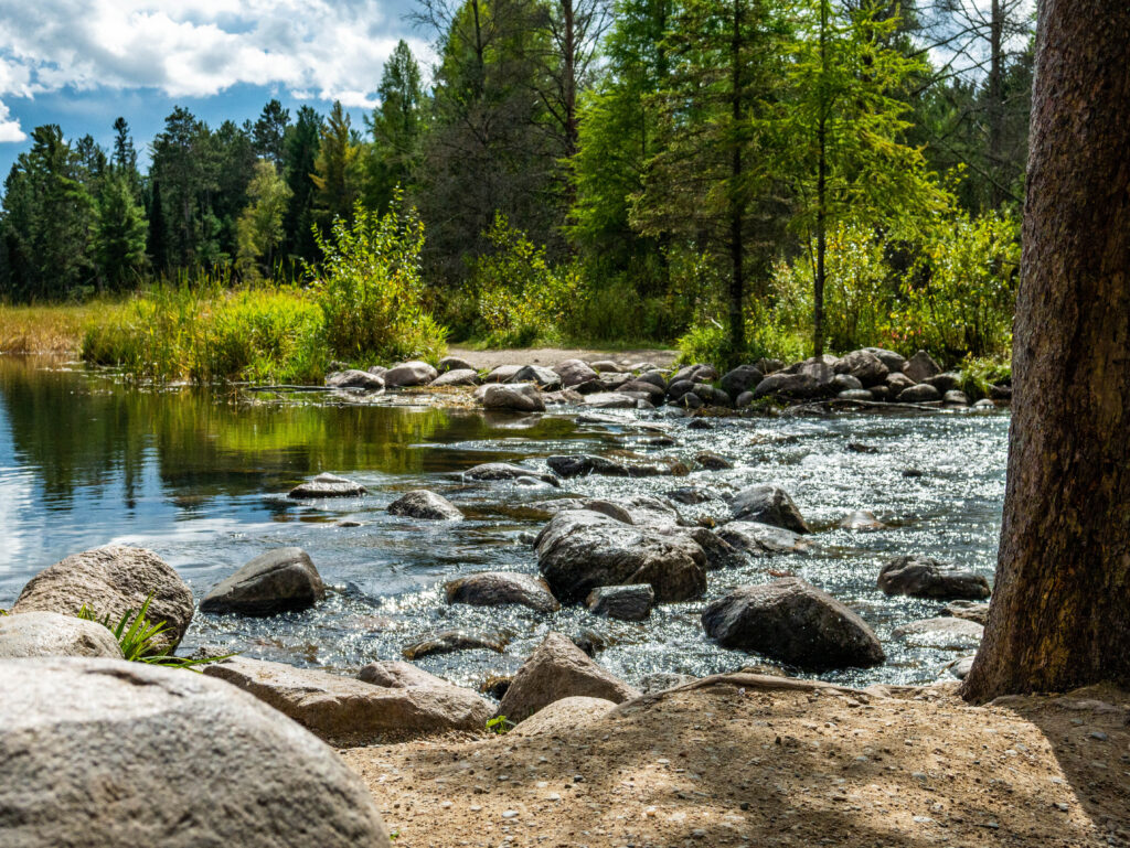
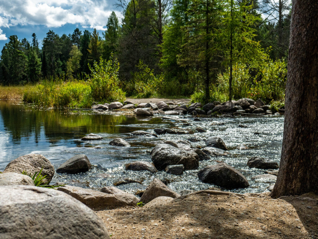
That’s all the sliders! Changing all the sliders can change some of the settings you originally liked. For this image, I thought the other sliders darkened the image too much, so I increased the exposure to +1.70. Now I’m happy with this edit. I hope this guide to photo editing was helpful.
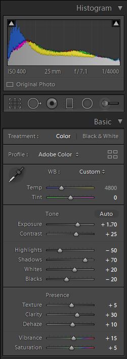
Below are my final image and settings.

Presets
If you’ve been following along editing and like your end product, you can save those settings as a preset to use on future images. It’s very simple.
Here’s how from Adobe: How to create your own presets
Presets are great for getting a photo close to where you want it, having a consistent look, or batch editing photos taken in similar conditions. Presets are simply changes to those sliders (also color and tone curves, profiles, sharpening, transformations, and effects) that are saved and applied to other photos. I have 10 presets I created available for free when you sign up to my newsletter on the Home Page of this site, if you’re interested.
Conclusion
Just try photo editing. It’s not that hard and lots of fun. There is plenty more to photo editing beyond the basic sliders, but that doesn’t mean you can’t make some great edits just using these. I hope this guide to beginner photo editing was helpful and you feel more comfortable editing your photos. Thanks for reading!